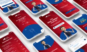
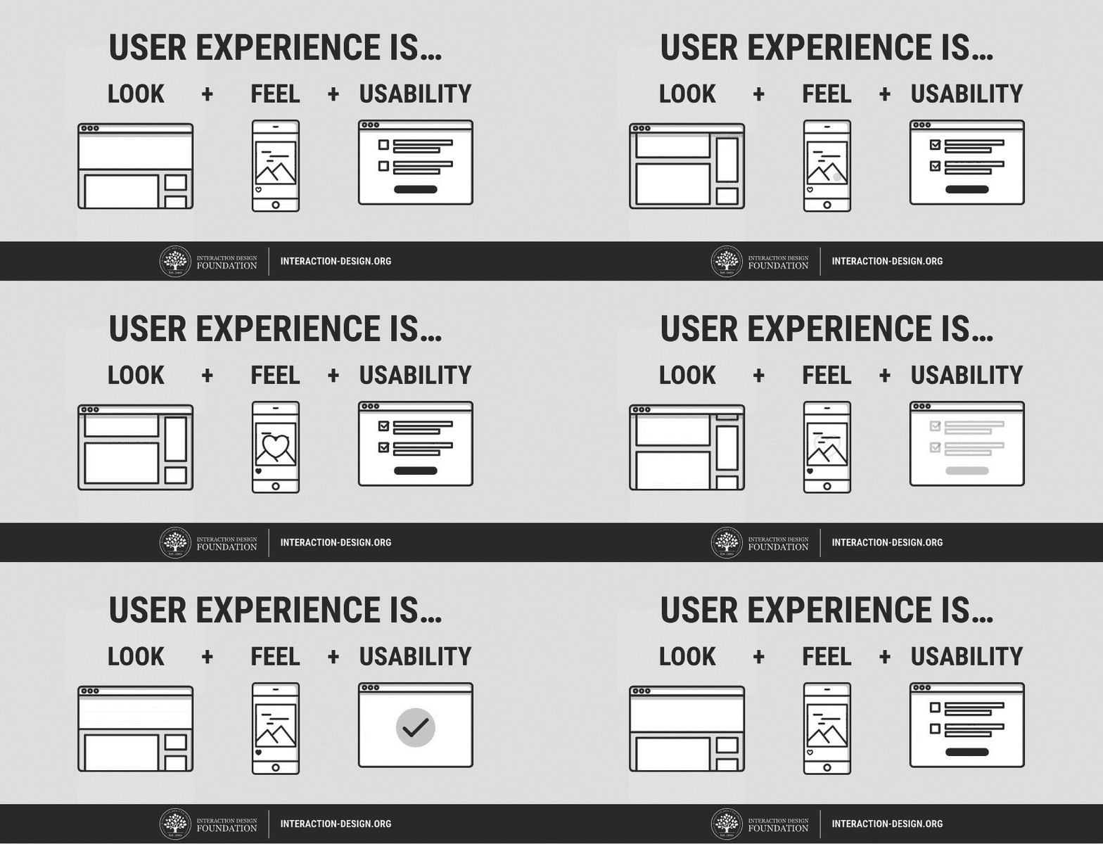
Our current generation uses a spectrum of advanced technologies in a multitude of businesses. From a company’s mobile application to their computerised last mouth delivery system, there are a slew of digital touchpoints for a consumer to engage with. The interactions and the perceived experience of the user is what we refer to as “user experience” (UX). Another term interconnected with UX is “user interface” (UI), which refers to the aesthetic layout and design of a digital platform. Both UI and UX form a connection in that UI is what the user sees and UX is what the user experiences – after – looking at the UI.
For Empathy, not to be confused with sympathy, the official definition would be: The ability to understand and share. In essence, it is a human quality that determines if an individual is able to step into the shoes of another and understand their thoughts, motivations and emotions. Not everyone is able to empathise, but it is a great skill to have when conversing with people.
With definitions clarified, it’s time to raise the question: What does empathy have to do with user experience?
The Importance of Empathy to UX
It can be challenging to conceptualise the relationship between having empathy and the effects it has on UX. Nevertheless, we should acknowledge the pertinence of a UX and being seen as reputable and credible among customers. 48% of people said that a website’s design is the number 1 factor when deciding on the credibility of a business. In this technologically advanced world, a majority of peoples’ first contact with a business will be online. Even for a B2B company that does not deal with the typical consumer, the initial interactions between a client and a supplier is crucial in making a good first impression.
When consumers or clients conduct research on a company, most will seek their online profile due to its convenience. 86% of consumers use the internet to find a local business. This is where the UI plays a vital role. There are a myriad of factors that contribute to a good UI. Aesthetic design, features, seamless transitions etc. At the same time, an essential factor in creating a good UI is empathy. For designers to craft a meaningful UI, or any design for that matter, they need to engage in the process known as design thinking. It is a 5-step process to guide designers to create brilliant works, and its first step is to empathise.
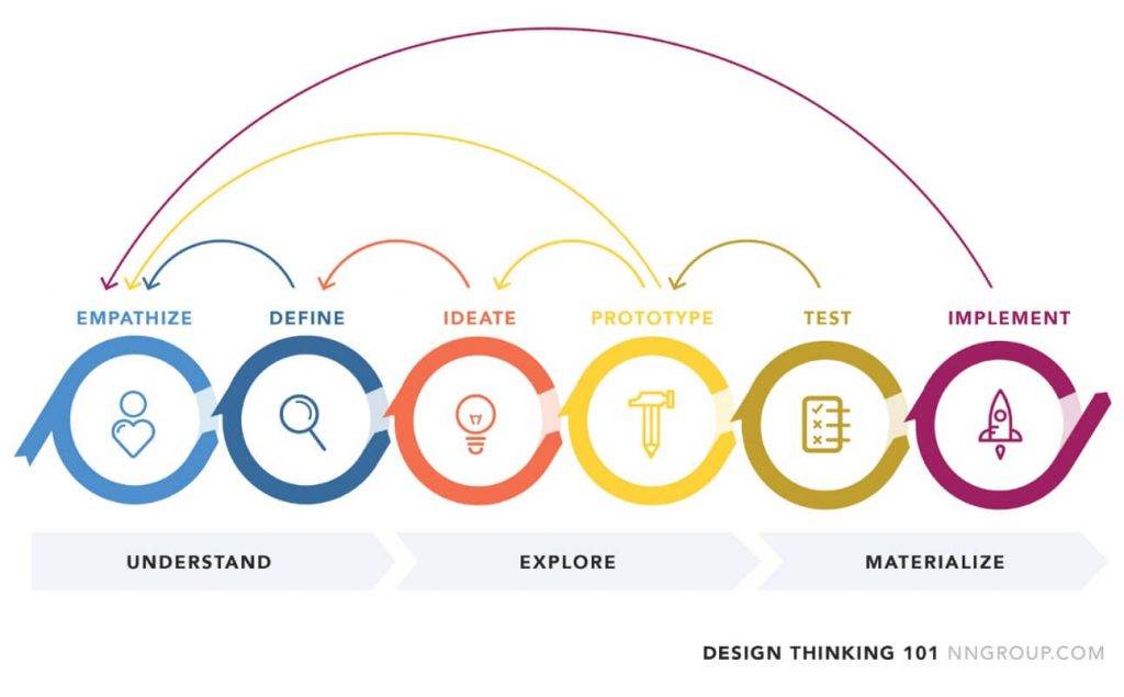
Design Thinking is not only applicable to designers, but to every member in the company. At Trinax, the operations team is tasked with the assembly and troubleshooting of the finished product/project. They are the very first members of the company that will see it in operation in the environment it was built for. Thus, they are the ones to ensure that the outward appearance of the finished project is appealing and free of aesthetic mistakes. Problems such as if the signage is misaligned, wires are exposed from the rear or lack of space for users to engage with the project are concerns that the operations team will take into consideration and rectify.


Trinax recognises the importance of empathy in every aspect of the business process, even when the project is in operation. To produce a good UX, all our departments encapsulate empathy throughout their work and is something which many users will take notice of as a result. This thoughtfulness for the end-user cannot be achieved by employees who do not practice empathy.
Statistics That Strengthen The Relationship
A great UX, one that is moulded through empathy, contributes to greater commercial success.
The Global Empathy Index 2015, which analyses the quality of a company’s empathetic approach, shows that the top 10 most empathetic companies increased in value more than twice as much as the bottom 10 and generated 50% more earnings. It is evident through this list that companies with empathy at its core will have stronger financial performance. When they embed empathy in all aspects of their business, users will take notice and hold the company in high regard.
Additionally, researching on characteristics of the consumer will lead the way in crafting a meaningful UX. 47% of people expect a webpage to load in 2 seconds or less. Without empathy and care for the end-user, most designers would not spend time internalising these statistics, let alone accommodate the user’s needs. They would expect the user to understand the necessity for a website to be given time to load all the required assets and images and thus would not be concerned about load times.
A study has shown that those who work in technology focused jobs are extremely unable to understand and address the issues of end-users. They assume the users have the technical knowledge equivalent to themselves and will find a workaround to any problem without difficulty. This is unfortunately not the case as the general public is not proficient in troubleshooting their technical issues; the reason why companies around the globe have customer support centres and helplines is due to this fact.
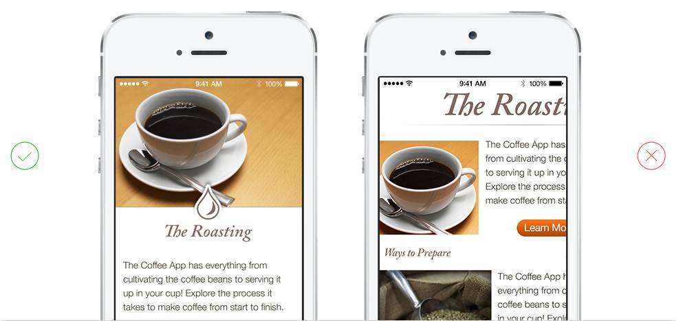
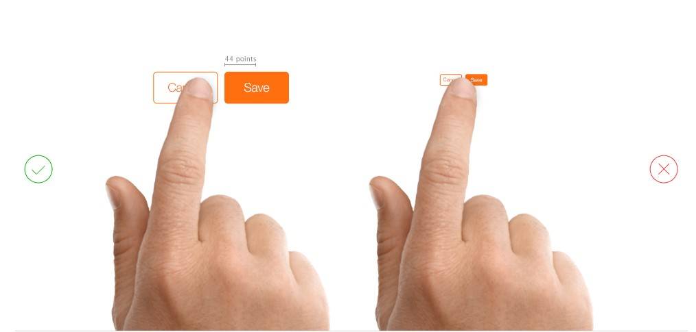
We have to be clear that the purpose of our design is to cater to the target demographic. This might seem obvious at first, but designers who are unable to empathise may unintentionally create an application or website tailored to them instead of the customer. To them, it would appear as perfectly functional and easy to navigate. To the average consumer, it could be anything but usable.
An Example of Empathy’s Correlation With UX
No one can deny Apple’s success. Their line of iPhones, iPads and iMacs are all products that majority have heard of. When one thinks of Apple, they often mention the clean, intuitive and uncluttered design language that is imbued in all their UIs. Their approach to designing an operating system is fixated on giving users, of every kind of technical expertise, a smooth and hassle free experience. In a Harvard Business Review, Steve Jobs cited that he travelled around the world and observed the actions of people from different walks of life as his way of doing research. This is a testament to Apple’s seamless UI design. They understand their audience, learn what satisfies them, and proceeds to craft their UI accordingly.
In contrast, Google created an online communication tool that combined e-mail, messaging, blogging, wikis and multimedia management all into one application. However, it was announced as a failure just one year after its launch. This was significantly due to the cluttered and complicated layout of the UI. The amalgamation of contacts, e-mails and messages was so overwhelming that it dissuaded users from even trying it. A clear case of designers possessing no empathy and assuming users would be willing to use a UI this laborious.

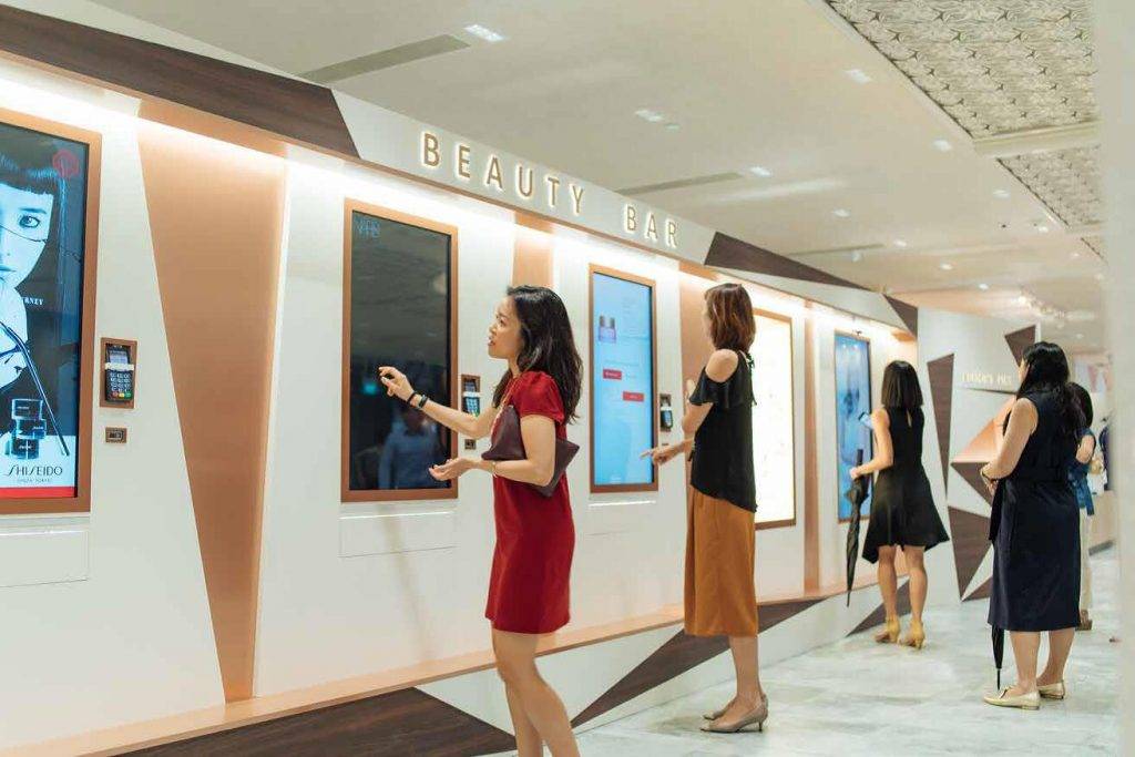
Trinax designed an automated retail kiosk for OUE, a real estate developer, that is currently in operation. It allows patrons to browse various cosmetic products using the interactive touch screen and make their purchases with a credit card. Not only does it remove the need for sales associates, it enables as many shoppers as there are kiosks to browse the catalogue at their leisure.
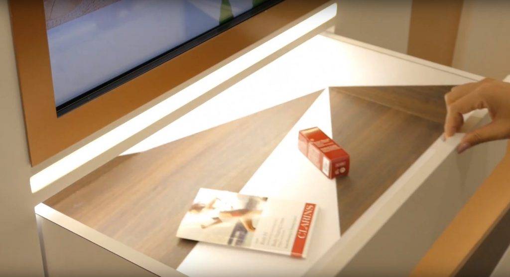
Empathy plays a part in this project in a unique fashion. When we thought of the target audience, we thought of elegant women who wish to have an attractive appearance at all times. Conventional kiosks would require them to bend down to receive the product, ruining their elegance and grace. For the OUE Beauty Bar, we decided to place the tray at waist-level. Once the purchase is complete, the tray will extend outward and present the beauty products to the customer. This entire process is seamless from start to finish, where the user will receive the item with ease instead of reaching down ungracefully to grab the product.

Our team of designers put in effort to incorporate empathy in the projects we embark on. From miniscule issues on the flow of the UI to placement of the interactive buttons on-screen, we seek to give the user the most enjoyable experience possible.
The Approach on Empathy Within Trinax
Discussions are held regularly to voice out concerns and opinions that each department has. On a previous occasion, hardware limitations surfaced when incorporating lengthy animations with large file sizes, causing stutters in the application. The design and programming team had a thorough discussion on how to handle the problem where programmers conveyed the technical issues to designers and, after much discussion, came up with a solution. To guarantee that the UX flows smoothly, the designers looped a shorter section of the entire animation to decrease file size but still ensure a seamless transition. Solutions like this can only be found through brainstorming and constant check-ups between departments. This has created a company culture that is cohesive and results in an overall increase in quality for our projects.
Trinax’s internal communications involve everyone, including our management board. Numerous reviews and conversations happen on a daily basis between the management team and other departments to achieve consistent quality on all projects. Frequently, the teams will be asked to step into the shoes of the target users, predict their impressions and accommodate their needs accordingly. In doing so, it will encourage viewing the UI from multiple perspectives and inculcate empathic approaches during UI conception.

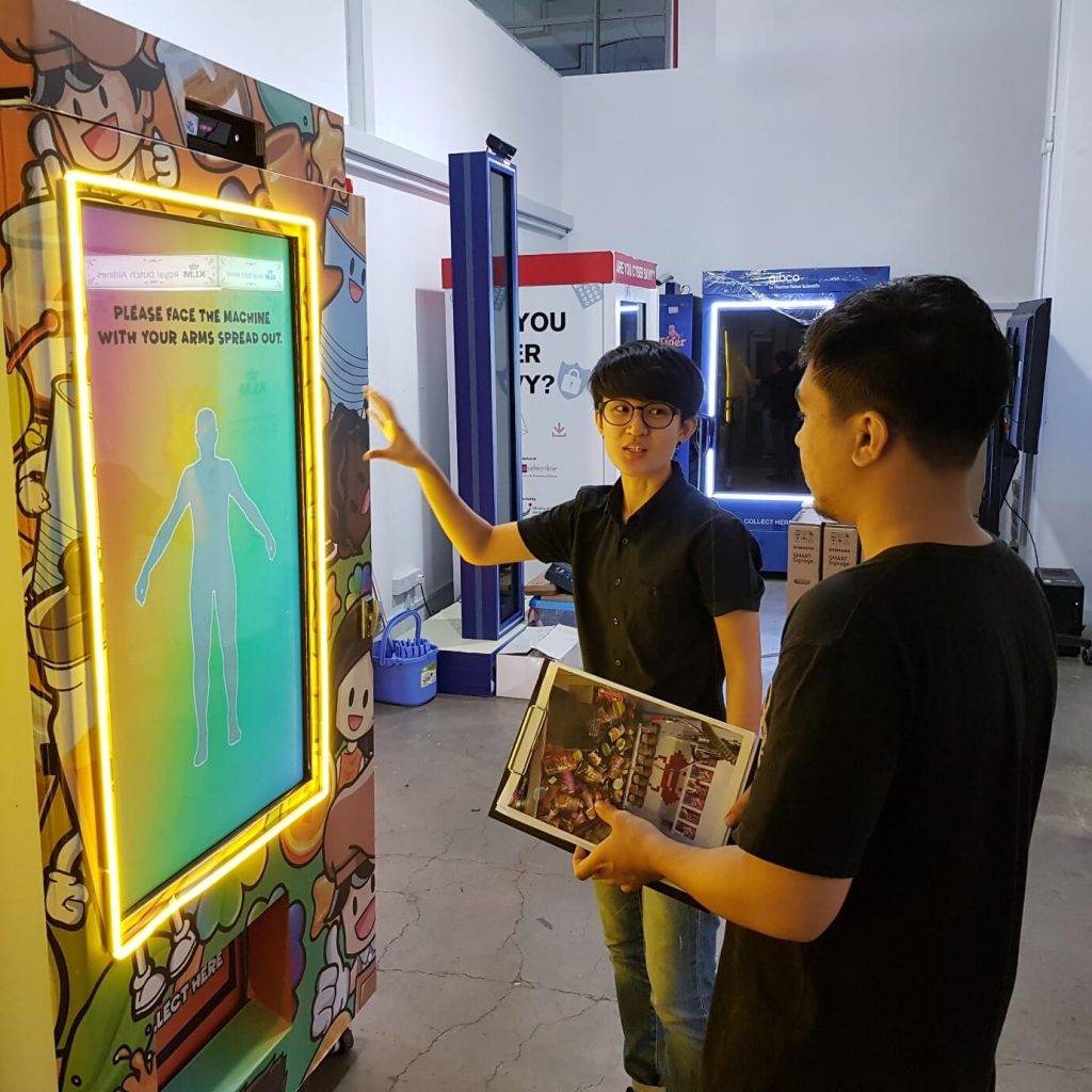
Outside of functional requirements, our quality assurance team is diligent in playtesting and simulating different scenarios that our projects could encounter. They also keep an eye out for disruptions in flow, such as the process for users to retry a game or to input their personal information. Questions like: does it take too long?, is it too tedious? will always be on the minds of our QA team. Although subtle, these little details will make a difference in UX. It is the difference between the user having a second attempt at the game or just leaving the exhibit all together.
A User Experience With Empathy in the Centre
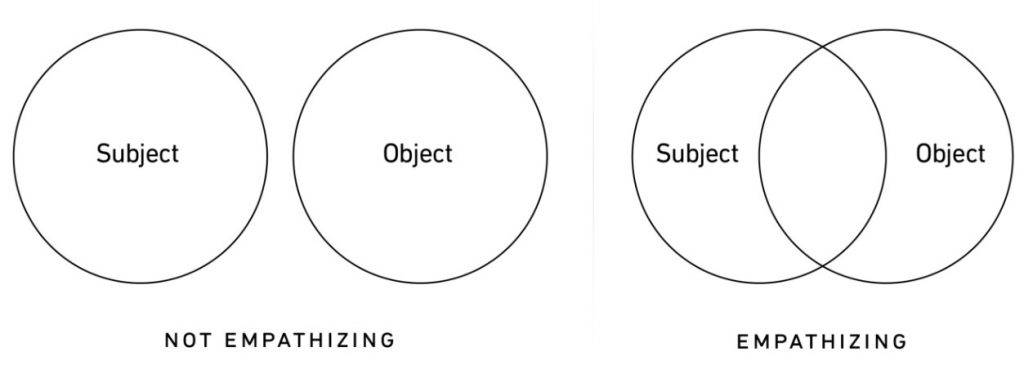
IDEO, the global design company, remarks that an empathetic design requires a “deep understanding of the problems and realities of the people you are designing for.” We need to envision what the user will feel, sense, imagine; the actions that will be taken after those cognitive processes culminate and become our mind’s thoughts. This cannot be done without empathy. We should be focused on how the user perceives the digital interactions with a company and ensure it is pleasing to our target audience.
Empathy pushes the boundaries of what constitutes a good UX. A UI can be aesthetically pleasing and brimming with features to make it look stylistic and aspirational. However, if negligible thought is put into how the user would interact with it, what grievances they might experience – no matter how minor – all of these subtle annoyances will accumulate and leave a sense of disdain in the user.
For a business to achieve undeniable success, there must be empathy.

